Please note: This site contains links to websites not controlled by the Australian Government or ESA. More information here.
Statistics: line graphs, pie charts and the mean
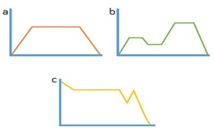
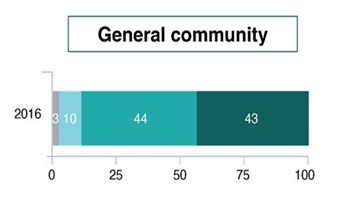
This guide provides a sequence of small steps for building experience of interpreting data, from using knowledge of scales to read information displayed in line graphs accurately to applying understanding of percentages of amounts to interpret pie charts through to calculating the mean average across contexts.
Additional details |
|
| Year level(s) | Year 6 |
|---|---|
| Audience | Teacher |
| Purpose | Teaching resource, Teaching strategies |
| Format | Downloadable resources |
| Teaching strategies and pedagogical approaches | Questioning, Explicit teaching |
| Keywords | graphs, pie charts, circles, percentage, explicit teaching |
Curriculum alignment |
|
| Curriculum connections | Numeracy |
| Strand and focus | Statistics, Build understanding |
| Topics | Data representation and interpretation, Multiplication and division, Percentage, Fractions |
| AC: Mathematics (V9.0) content descriptions |
AC9M6ST01
Interpret and compare data sets for ordinal and nominal categorical, discrete and continuous numerical variables using comparative displays or visualisations and digital tools; compare distributions in terms of mode, range and shape |
| Numeracy progression |
Interpreting and representing data (P4)
|
Copyright details |
|
| Organisation | White Rose Maths |
| Copyright | © 2021 White Rose Maths. Free-for-education material. |
Related resources
-

Percentages: understanding, converting and calculating
A guide to understanding and learning to operate with percentages.
Resource details -
Fractions, decimals and percentages: Year 6 – planning tool
This planning resource for Year 6 is for the topic of Fractions, decimals and percentages.
Resource details -
Decimals: multiplying and dividing decimal numbers
A guide to extending knowledge and skills for operating with decimal numbers.
Resource details -
Fractions, decimals and percentages: Year 5 – planning tool
This planning resource for Year 5 is for the topic of Fractions, decimals and percentages.
Resource details